The wider context
Although only a short amount of time has passed since we first partnered with Bakken & Baeck on our identity, it’s been a long time in startup years, and a lot has changed within Cord.
We’re now laser-focused on building components and SDKs that make any product collaborative, and we knew we needed a brand that would serve this product offer and positioning better. Specifically, I wanted to ensure our any updates to our identity reflected our mission: to make the internet multiplayer.

Where to start?
As the person responsible for brand design, I started the process by looking at our mission. I wanted to find a hook that underpinned everything we do, and ended up writing this:
“Everything starts with chat. Whether that’s @mentioning someone on a page, adding an annotation, assigning a task, or sending a file. It all starts with chat. We keep teams talking”
This simple way of thinking about Cord was the breakthrough that let us start moving our brand in the right direction. We knew we didn’t want to lose the essence of what we had (as well as any recognition we’d built up), instead we wanted to build on it, giving it more purpose and more oomph on the (web)page.

The vernacular of chat
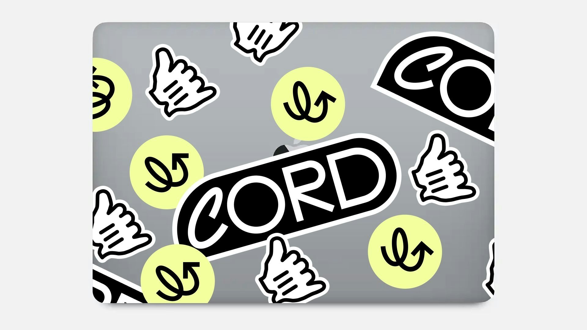
The curved edge of the existing wordmark allowed for the creation of a perfect bubble shape — familiar from chat apps, but in combination unique enough to be recognisably Cord. This simple addition helped give the wordmark more presence and weight on the page, whilst laying the foundations for the work to come.

Through a process of iteration (and simplification!), we built the chat idea into a new typographic system, to further help with the connection between what we say and how it’s displayed. This simple device of stacking words and sentences allows us to communicate complex ideas, and is dynamic enough to handle all the situations the web can throw at it.
As we developed system more and more, it felt easier to communicate what Cord is and does:

Make the internet multiplayer
At the heart of what Cord is building is a way for engineers to add collaboration to their own tools, and bring more people into their products.
As there’s no collaboration without people (we hope?!), it was important to make sure there was a human touch to the brand, whilst steering away from the now all-too-familiar multi-cursor aesthetic.
We wanted to focus on what users can do with Cord, and explored the idea of using the familiar browser cursor states (’pointer’, ‘grab’ etc.) as a starting point. With some new, expressive gestures, these digital hands represent the different people you work with, and the things you can do together using Cord. This has so far proved to be a useful device to bring energy and that much needed human touch into places that might otherwise feel dry or text heavy.

A simple system to roll out
I started to think about our new visual language as a simple set of building blocks, which allowed us to roll it out across multiple channels including the website, podcasts, videos, and (most importantly) swag.
The aim of this project was to align Cord’s brand with its business, and turn solid foundations into a usable system, and hopefully we’ve started to do just that.
This is just the start for where we think the world of collaboration can go, so watch this space!


